


DIY web design: 7 brilliant ways to give your website a glow-up


Whether you want to get more bookings, sell more products or simply want to spruce up your professional brand, how you design your website matters. If you’re a sole operator, you can DIY with these key design principles in mind.
A website that looks great and works hard is a must-have for small businesses, but building one can feel like a stretch when design isn’t your day job.
The good news is today’s drag-and-drop website builders make polished, high-quality results easily accessible for most people. Even better, many now come pre-packed with smart tools that help you nail the design choices that shape your customer’s experience.
How, you ask? We’ve dug into website builder Squarespace‘s Guide To Website Design workbook and pulled out some of the top tips to help you optimise your business website with confidence.
Colour shapes how people feel about your business before they read a single word, and Pantone research shows colour can lift brand recognition by up to 87 per cent.
Studies by Labrecque and Milne found that different industries tend to develop colour “norms”, which can help guide your choices.
In trust-driven sectors like finance and professional services, blues and greys are popular for their steady and dependable vibes.
For more expressive fields like beauty, fashion, hospitality or kids’ services, warm yellows and reds can add energy, while soft greens and neutrals create a calm, grounded feel for spa or well-being services (unsurprisingly, they’re popular with boutique builders and real estate sites too).
Whatever direction you choose, keep the palette simple. One main colour supported by one or two accent shades usually creates the cleanest result.
If you need a hand, Squarespace’s Design Intelligence Site Themes tools feature curated design styles – all you have to bring to the table is your theme (yes, yoga shirts or edgy fro-yo café will suffice). Site Themes will then deliver designer-created colour palettes, font packs and button styles that can be mixed and matched into 1000s of combinations.
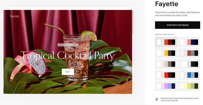
Likewise, typography plays a quiet but powerful role in shaping how your brand feels. Serif fonts feel classic and formal, sans serif fonts evoke a modern, friendly tone, and script fonts add personality but work best in small doses.
As a rule of thumb, match your chosen style with the tone of your work. A clean sans serif can reinforce clarity and trust for a bookkeeping service, or you could try combining a simple body font with a script header if you’re a wedding photographer looking to convey warmth.
Again, simplicity is important; stick to two fonts at most to keep your site clear, consistent and quick to load.
Well-chosen icons do more than reinforce your brand identity; they give visitors quick visual cues that make your site easier to navigate.
Arrows work well in galleries and carousels, helping people move from one item to the next.
Simple, recognisable icons on call-to-action buttons can also lift engagement by making actions like “Shop now” or “Book” feel clearer and more immediate.

At the risk of stating the painfully obvious, website speed has a direct link to how long visitors stay. Cloudflare data shows faster pages lead to more completed actions, whether that’s booking, buying or simply reading what comes next.
There are a range of simple steps to optimise your site’s speed. Use web-safe fonts such as Arial, Georgia or Verdana, break long pages into bite-sized sections and show blog excerpts instead of full posts.
If you sell products, compressing high-resolution photos can make a noticeable difference in how your shop loads. Squarespace’s tools also optimise images automatically, which takes some of the technical load off your shoulders.
As well as thinking about the visual style of your site, take a moment to consider who your audience is and what they need to find quickly. Sketch a simple wireframe (or pencil sketch) to map out how people will move through your pages.
Once the structure is in place, create a quick draft version of your site in your builder. Panic not; modern tools make this surprisingly simple. Squarespace, for example, lets you add a few key sections, drop in placeholder text and click through it in preview mode to see what feels smooth and where someone might hesitate.
Pages with a single purpose are easier for visitors to understand. Determine the main action you want people to take on that page and ensure you use a clear heading that reflects this.
If your business runs courses or offers member-only content, you can direct visitors to sign in or register from the same page, or if you invoice clients, linking straight to a payment point can help keep the process smooth.
Drag-and-drop builders make this easier by giving you functional blocks you can add as you design. For example, Squarespace includes built-in scheduling, payments, and invoicing, so each page can stay focused on one clear step without relying on multiple platforms.
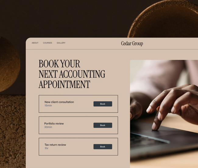
Most browsing now happens on smartphones, and Baymard’s mobile UX studies show visitors are skimming quickly. This means putting the most important information near the top of each page, using short copy, descriptive headings and easy-to-tap buttons.
A café offering online orders, for example, might put its menu and “Order now” button right at the top of the mobile layout for customers on the go.
You don’t need to be a designer to create a polished, user-friendly website. With a few simple principles and the right tools, you can get there relatively unscathed.
FLYING SOLO SPECIAL OFFER: Get 10% off your new Squarespace website with this code: BIZ10
*Offer valid until December 30, 2029.
This article is brought to you by Business Builders in partnership with Squarespace.
Feature image: Squarespace.

Comments